
Written By: Eishwari Mainkar
Ever wondered why horror movies look eerie or why romantic comedies usually seem bright and breezy? Well, majorly, it's because it is all a play of colour and manipulating it in a way that enhances visual aesthetics while also setting the mood of a film. The art of playing with colours to set an atmosphere relevant to the genre, scene, or emotion is what we call Color Grading.
Colour grading is one of the most crucial aspects of the post-production process, and rightly so! Trust me on this one, but it is every visual artist's secret little ingredient that could bring life to a dull, lifeless shot with just a sprinkle of colours.
Here, symbolism and association are your best friends. How, you ask? If I was to ask you to describe love or romance using just colours, what is the first colour that pops in your head and why is it RED? Exactly. Every colour is mostly associated with a mood and genre. If you want a mysterious, Twilight vibe, you go with your dark Greys, Blues, and Greens, while the yellows and oranges are reserved for the happy, cosy vibe.
Every genre has its colour palette, almost like a template that most filmmakers follow. Over the years, people have started associating these colour palettes with their respective genres. The vibes of all movies of the same genres are more or less the same, but it is made specially. Several other things go into the picture when developing a film, like editing styles, cinematography, and art direction.
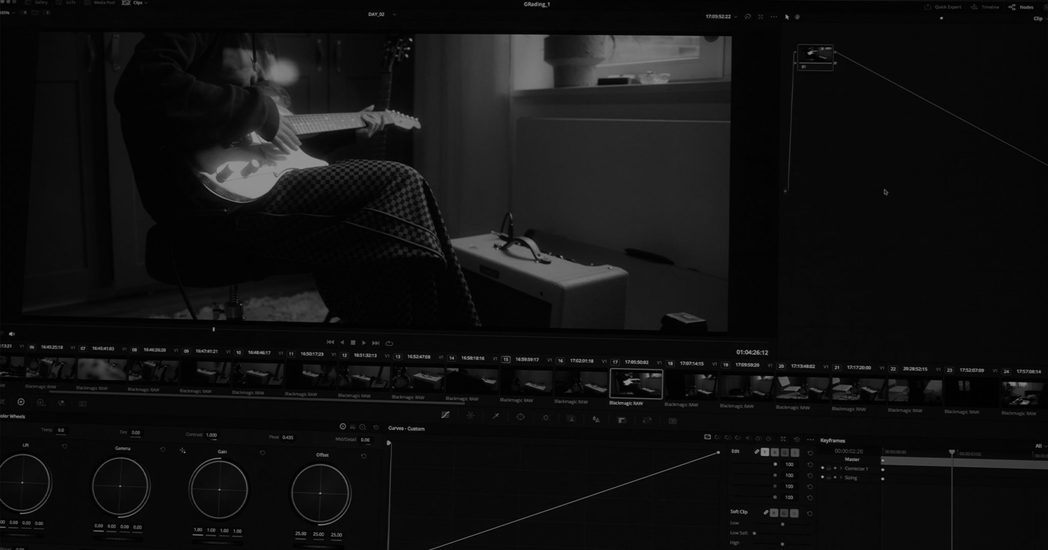
Let us take a look at how much of a difference colour grading can make in a single frame!

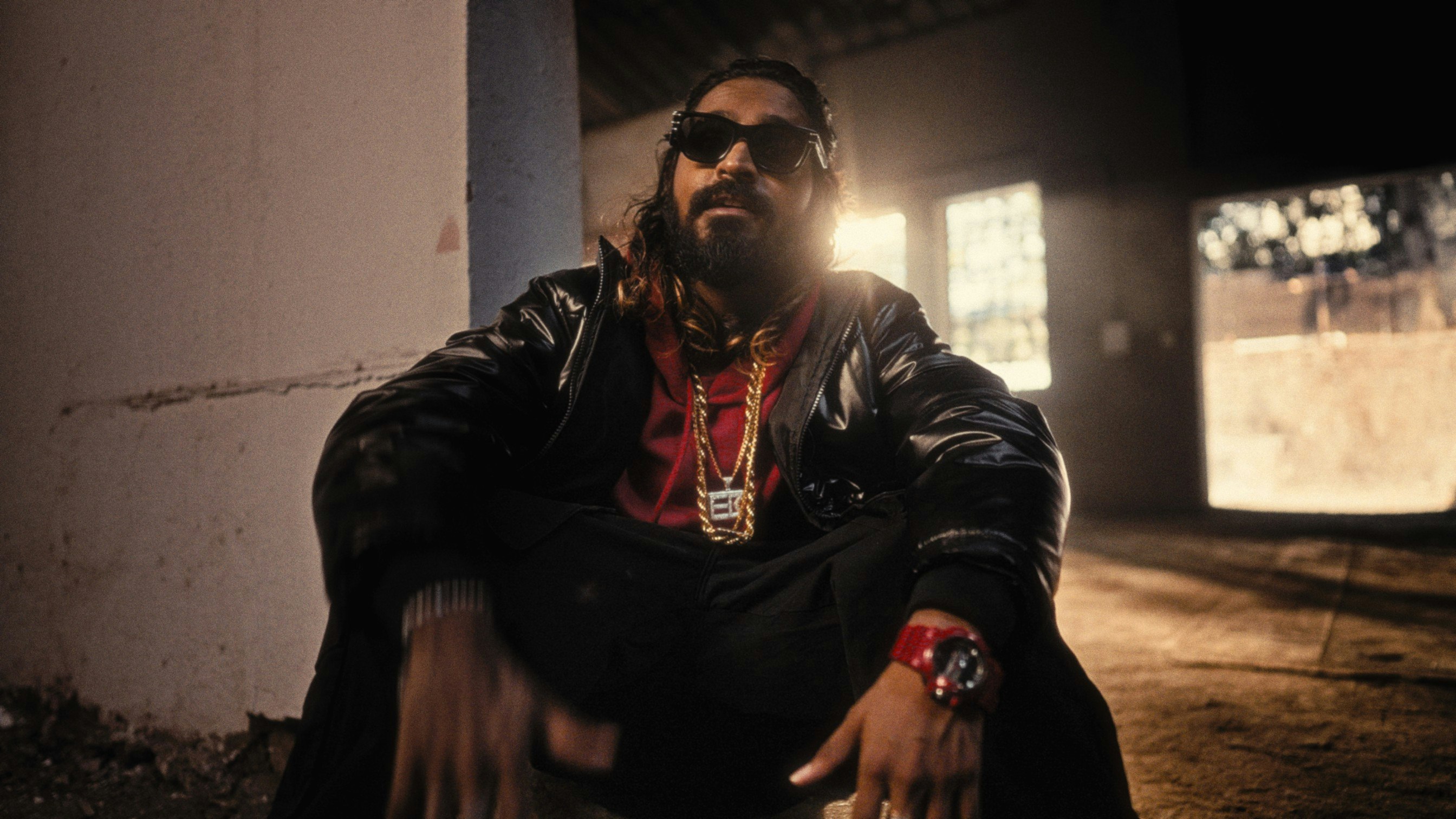
This still is taken from the music video of Emiway's "King of the Street" that we shot. The first picture is completely ungraded while the second one is after it is color graded. The difference a colour wheel can make is magical, isn't it? Well, in this case, the colour palette mainly used bold colours such as red, brown, and black.
These colours usually represent power and sovereignty. All this describes Emiway! The style of his music, which is generally very vulnerable, powerful, and socially uplifting is all kept in mind before deciding the colour theme for his music video. They are harmonised in such a way that the overall theme looks uniform and well-blended!
All-in-all, colour grading is our wizard and the tools are our magic wand. If you know how to cast the spell right, it can do wonders.